Desmos Accessible Graphing Calculator Guide
Creating Interactive Graphs with the Desmos Graphing Calculator
The Desmos graphing calculator is a free online graphing calculator with many accessibility features.
For instructors, Desmos can be used by to create:
- Interactive, embedded graphs that are also fully accessible.
- Images of graphs that are visually accessible.
For students, Desmos can be used as an accessible, web-based graphing calculator.
Getting Started
To get started with Desmos, users can check out Getting Started: Desmos Graphing Calculator from the Desmos Help Center.
The help center also includes a dedicated Desmos Accessibility section, which includes suggested settings for screen readers for optimal compatibility.
For hands-on learning activities to help familiarize both instructors and students with Desmos' accessibility features for the visually impaired, visit the Perkins School for the Blind Resource Center and search for "Desmos".
Usage Notes
The following issues were noted during tool testing (updated as of 12/1/2025):
- The default orange color for graph elements does not meet WCAG color contrast guidelines. All other default colors do.
- For undefined points, Desmos will spell out "undefined" for screen reader users with each letter enclosed in quotes. Using Desmos' recommended screen reader settings makes this quirk less inaccessible.
- The Desmos User Guide (view only) is a Google Doc, and may therefore have accessibility barriers for screen reader users. For this reason, the Desmos Help Center is a better option.
- As of 12/1/2025, screen reader compatibility mode appears to be turned on, but it is unclear if this will be the default going forwards.
- If screen reader compatibility mode is not turned on, it can be at Desmos User Guide (limited edit view).
- When graphing data tables, you can copy-paste a data table into, but not out of Desmos.
- On embedded graphs, the audio trace function can be called when the graph is selected via tab-order, but not by mouse-click.
- Accessibility features do not apply to polar graphs.
Increasing Interactivity with Sliding Points
Desmos allows you to graph individual points. Figure 1 below demonstrates how graphing a point (n,f(n)) and turning on the "label" option creates a point that is easier for students to grab and move along the curve to see coordinates.
Try It! The graph below is interactive, so you and your students can manipulate it in real time.
Increasing Interactivity with Audio Trace
The audio trace function can also be used by all students to navigate the graph more discretely. On embedded graphs, this functionality is tab-order accessible, but not mouse-selectable. To get around this limitation, instructors should put a heading directly above the embedded graph. To access the audio trace function, click on the heading directly above the graph and press tab until the graph area is selected by a blue outline. Then press Alt + T. To hear the audio trace, press H.
Selecting a curve and using the left or right arrows while in audio trace mode will move along the curve by one fourth of your x-axis step value (as set in the Graph Settings Menu).
For students using the audio trace function for accessibility purposes, Desmos' accessibility demonstration video explains the meaning of the various sounds used. In short:
- Audio traces move from left to right on the selected curve.
- Pitch raises and lowers with the y coordinate.
- Static indicates that the current y coordinate is negative.
- An added overtone indicates that the current x coordinate is positive.
- A pop denotes an point of intersection.
Example Use Cases
The following examples were created in Desmos to highlight specific features and limitations.
Basic Function Shapes
Figure 2 is an example of an embedded graph that is functional for all students. Students can interact with the graph on the current page or click on the "Edit Graph" icon in the bottom right corner to explore further without changing the original.
This example also uses Desmos' ability to use different line styles to create a graph that is visually accessible. The dashed and dotted lines ensure that all visual users can distinguish between the three lines.
Screen reader users can also use Desmos' accessibility features in conjunction with their screen reader to hear the graph described, or audio trace the curve of the graph.
Try It! The Basic Function Shapes Graph below is interactive, so you and your students can manipulate it.
Audio Trace in Action
The following video shows an example of a user using the audio trace function to hear the shape of the different function types:
Try It! Follow the directions under the audio-trace section above to see how the sonification works.
Weak Acid Titration
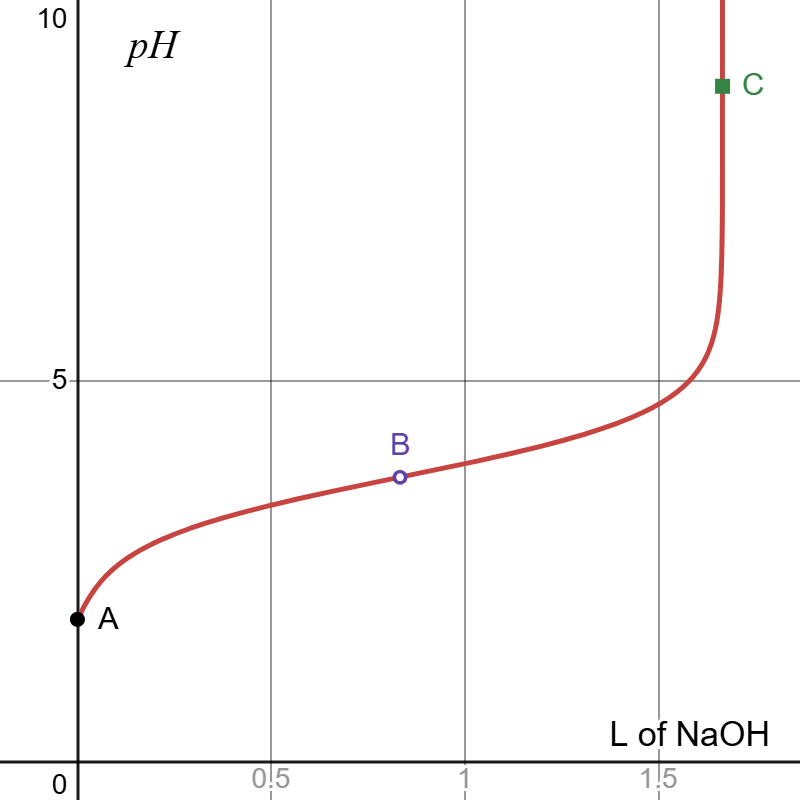
The titration curve in Figure 3 was created by graphing the curve and then overlaying the three points of interest on top of it. Audio tracing it allows students to hear how the curve flattens in the middle buffer region.
Try It! Follow the directions under the audio-trace section above to see how the sonification works.
In cases where pedagogical needs require that the students be unable to view actual values, Desmos graphs can be exported as visually accessible, static images and embedded with manually added alt text and extended description, as shown in Figure 4. Depending on the complexity of the graph, however, it may be more feasible to produce such graphs in another program as the strength of Desmos lies in its web-based availability and interactivity.
Extended Description of Figure 4
Figure 4 shows a graph with x-axis visible from 0 to 1.8 labeled "L of N a O H" and y-axis visible from 0 to 10 labeled p H. The graph increases from left to right, first sharply, then gradually, then sharply again. Three points are labeled on the curve. A is on the y axis, B is in the middle of the flatter section, and C is on the steep section at the end.
Heating Curve (Piece-wise Functions)
The following heating curve for one gram of water was created using a piecewise function with a moveable point overlayed. The audiation of this curve clearly distinguishes between the rising and flat sections.
Try It! Follow the directions under theaudio-trace sectionabove to see how the sonification works.
Note that the x-axis crosses at the zero point, rather than below the graphed line as might be more conventional for this style of graph. This is one limitation of Desmos— the user cannot change where the axes cross.
Determining Reaction Rates (Linear Regression)
In Figure 6, the kinetic reaction data regression graph to determine reaction order was created using a single data table with four columns: ,
,
, and
. Although pedagogically it is unlikely that all three options would be plotted on a single graph, the example was constructed this way to better facilitate discussion of Desmos' data table graphs.
The headings for the , and
columns were entered as simple functions so that the data would be automatically calculated based on the
. Desmos also allows users to graph regression lines, albeit only one at a time per data table. In this case, a linear regression line for
is shown. Regression lines are also limited to color differences: they cannot be formatted to be dashed or dotted.
Regression lines can be exported to separate functions to be customized further, but the overlap between this feature and the ability to use simple functions as table headings is weak. When attempting to export the regression line for , Desmos gives an error message, as shown in Figure 7.
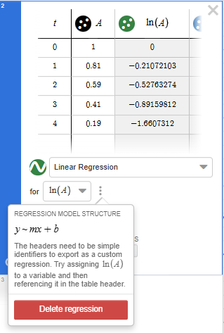
Desmos Error Message Description: The error message tells the user that Desmos cannot export the regression because "the headers need to be simple identifiers... try assigning to a variable and then referencing it in the table header."
Plotted data can be audiated and interacted with just like functions. When a table has multiple columns, each set of coordinates— in this case ,
, and
—is each treated as its own function.
Try It! Follow the directions under theaudio-trace sectionabove to see how the sonification works.