Chemical Diagrams

Making Chemical Diagrams Accessible
From using circles to represent atoms in a box to galvanic cells and molecular orbital diagrams, chemistry is full of topics that are often taught in a visual-heavy format. Learning to make these topics accessible not only benefits students with visual impairments, but also can help reinforce all students' understanding of the underlying concepts that these diagrams represent.
Color Usage
One accessibility standard that applies to all course content, but is often especially relevant for Chemistry diagrams, is the standard against using color alone to convey information. For example, in a cartoon of a water molecule, using a white-filled circle for hydrogen and a light blue-filled circle for oxygen would not be accessible for students with certain visual impairments.
Common ways to overcome this accessibility barrier in diagrams include:
- Including a label as well as color— for example, molecular models that also include atomic symbols.
- Using different fill patterns (e.g. solid versus striped) or outline patterns (e.g. dashed versus solid).
- Picking colors that are still distinguishable by shade even when all other color information is removed.
This last method is the most difficult to successfully implement and is generally not recommended as a default.
Further information on the color alone standard can be found throughout our Make Your Course Accessible site, including in our Document Accessibility Guides and LMS Accessibility Guides. To better understand the importance of accessible color usage in general, see WebAIM's Contrast and Color Accessibility
Images of Diagrams
Most diagrams found in Chemistry courses are currently presented as images. These images are generally complex enough to require extended descriptions as well as alt text. In addition to the all-purpose information on alt text found at WebAIM's Accessible Images and WebAIM's Alternative Text, the Poet Diagram Center: How To Describe Images has more STEM-specific examples. Instructors may find the sections on diagrams and flowcharts to be particularly relevant.
Keep in mind that alt text and extended descriptions for diagrams should reflect the context of the surrounding material. Sometimes, an otherwise complex image will only need a short alt text description if the information is already presented as text to all students on the page. This is also true of periodic table images (see our guide on Periodic Table Accessibility).
Multi-Part Images
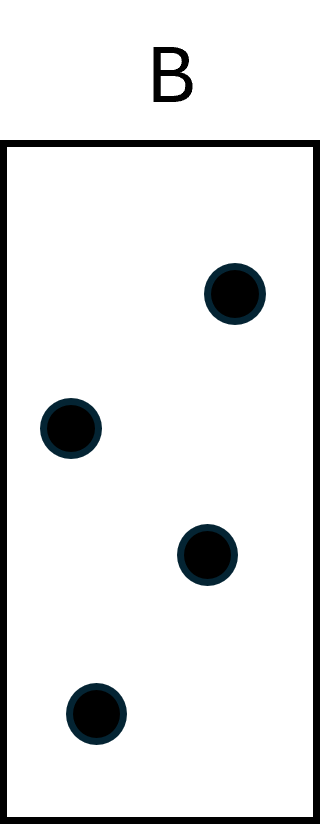
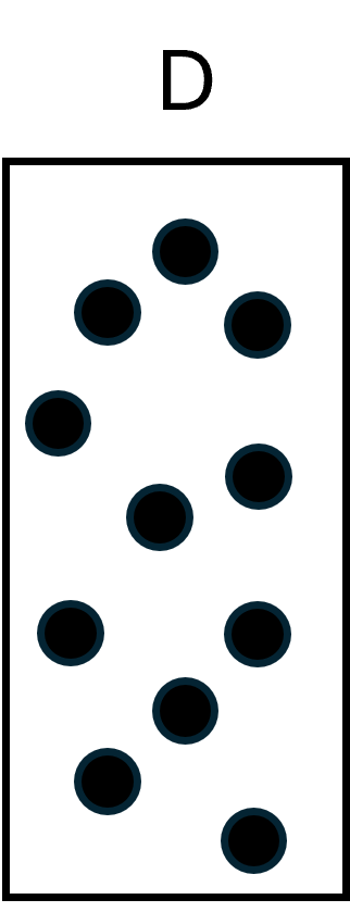
Sometimes, a multi-part image may be more accessible if split into multiple images. One common example is answer choices that are presented as visual images. Figure 1 below has four answer choices in it. The alt text on this image reads: "4 boxes with circles inside. Box A is small with 4 small circles. Box B is large with 4 small circles. Box C is small with 4 large circles. Box D is large with 11 small circles."
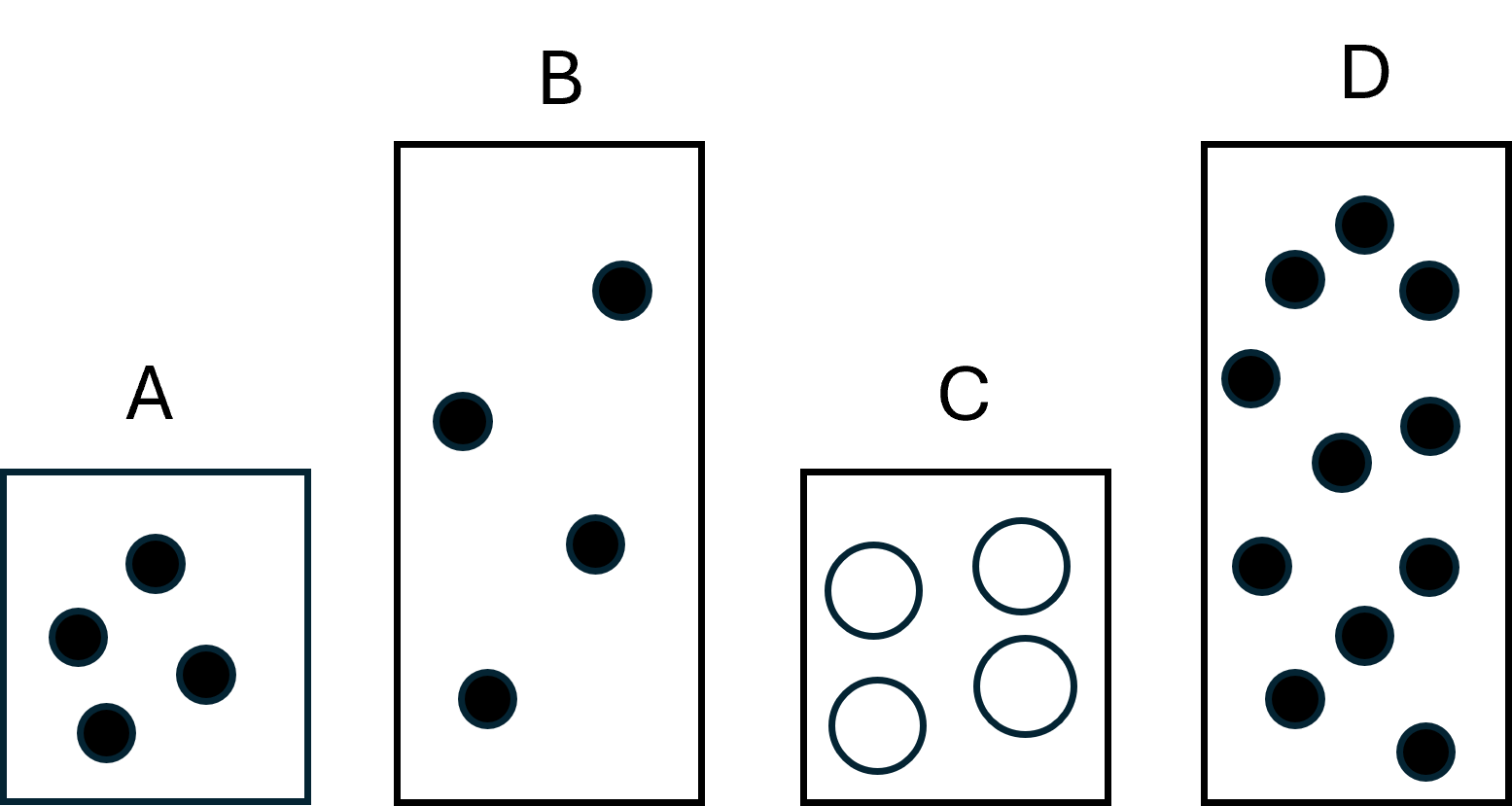
Breaking the image up into four images separate images (A, B, C, and D) would allow screen reader users to move back and forth between the answer choices. This also helps keep the alt text concise for each individual image. Figure 2 below shows the image as four separate images, each with their own alt text:
- Box A. Small box with 4 small circles inside.
- Box B. Large box with 4 small circles inside.
- Box C. Small box with 4 large circles inside.
- Box D. Large box with 11 small circles inside.


With such an example, instructors might want to consider:
- What is the pedagogical purpose of providing the answer choices as images?
- Could I test for the same knowledge or understanding by providing the information in table or text form, either instead of, or in addition to, the images?
- Is there a better way to present the images in general?
- Could I add figure captions for each image as it's own figure rather than embedding the letters in each image?
- Could I provide each image in its respective answer choice, or are my answers choices things like "A and D only"?
- Does my alt text give students enough information to successfully compare the options?
- Is alt text like "large box" and "small box" sufficient, or do I need to use "full-sized" and "half-sized" so that students understand the relative sizes?
- Is the color difference relevant or just reinforcing the circle sizes?
Pedagogical Considerations and Templates
A lot of instructors worry that adding alt text will give screen reader users an added advantage by giving additional hints or even answers. For example, using the terms "first energy level" and "second energy level" inside an extended description might make sense for a diagram presented in lecture, but might present issues on an exam. Here are some tips for avoiding issues like these:
- Use descriptive rather than interpretive alt text. Try to make alt text and screen-reader labels descriptive rather than interpretive. For example, "circle" instead of "atom". This is a place where context will be key. At some point, using "atom" is likely to transition from being considered interpretive to descriptive.
- Align terminology with surrounding text. Use the same terms in the alt text that are used in the surrounding text available to everyone. It's not giving anything away to say "balloon" and "rigid tank" in the alt text if the items are openly referred to that way in the text of the problem as well. This can also work in reverse: if you find a term necessary in the alt text and it doesn't otherwise interfere with your pedagogy, consider using it in the visible text to give everyone access to the same information.
- Bridge symbols and concepts. Use descriptive terms alongside interpretive terms when teaching concepts so that all students have the same opportunities to form associations between symbols and what they represent. Doing so benefits all students by ensuring that they grasp associations that the instructor may take for granted (e.g., the individual boxes or lines in M.O. diagrams represent orbitals while the levels represent subshells).
- Example: Instead of "Let's draw two orbitals," consider "Let's draw two boxes representing orbitals."
- Example: When teaching about the buffer region on a titration curve, consider making a point to refer to it as "flat" or "flatter."
- Maintain consistent syntax. Be consistent in your descriptive syntax and terminology just like you are with your chemical terminology.
Example Template for an Electrochemical Cell Diagram
One way to bridge symbols and concepts and maintain consistent syntax is to create a template for your extended descriptions where the structure emphasizes the same patterns you would expect sighted students to use to recognize a diagram with its labels removed.
Lecture Slide Example
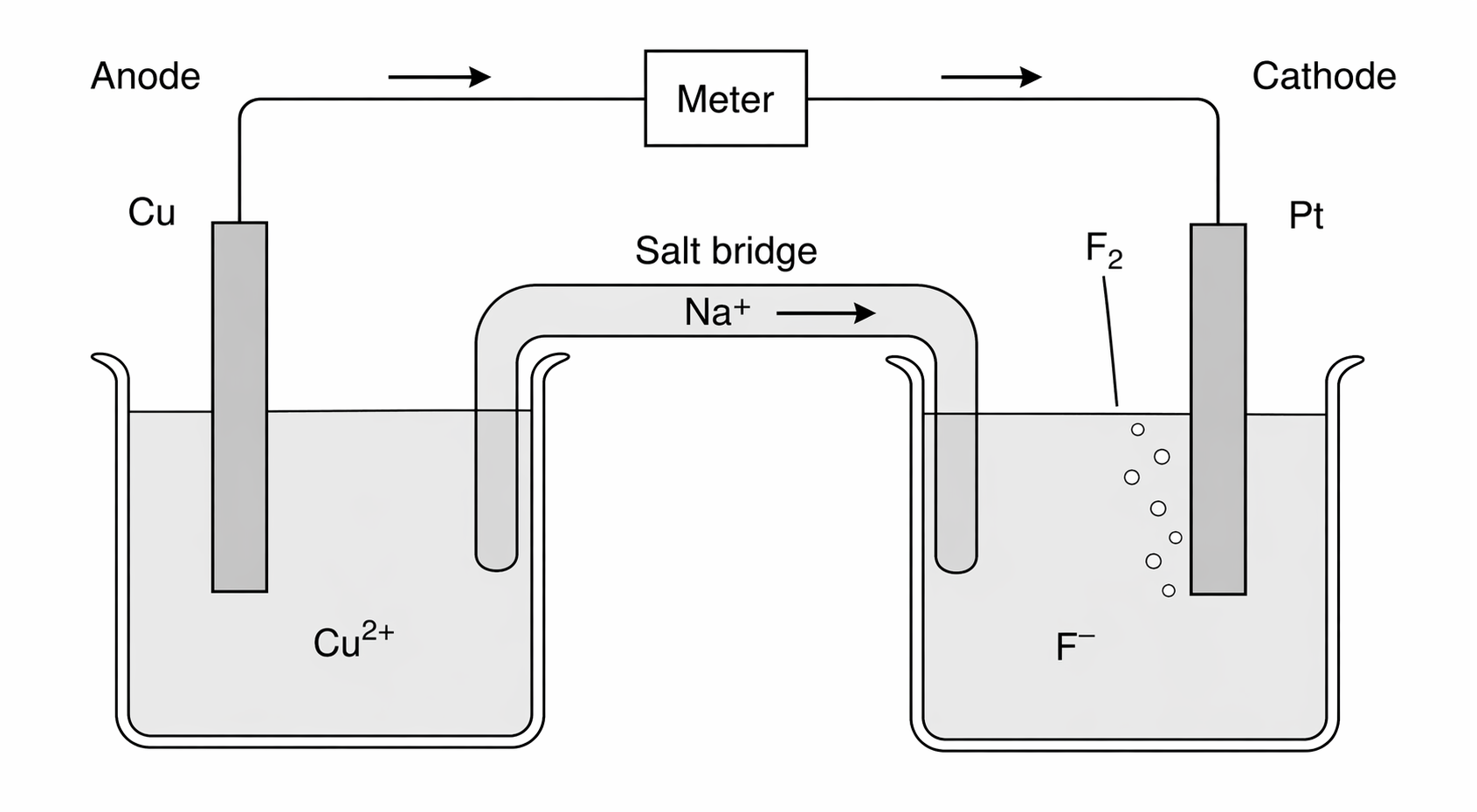
Figure 3 shows an electrochemical cell on a lecture slide. An extended description of that figure might look something like this:
Extended Description for Electrochemical Cell (Lecture Slide)
- Beaker labeled anode containing:
- Electrode (rectangle), labeled
- Water (shaded area) with
- Wire (solid line) connecting electrodes with meter (box) in center
- Arrowheads along line point left to right
- Beaker labeled cathode containing:
- Electrode (rectangle), labeled
- Water (shaded area) with
- Salt bridge (tube) connecting beakers containing:
- with arrow pointing right.
- with arrow pointing left
Exam Question Example
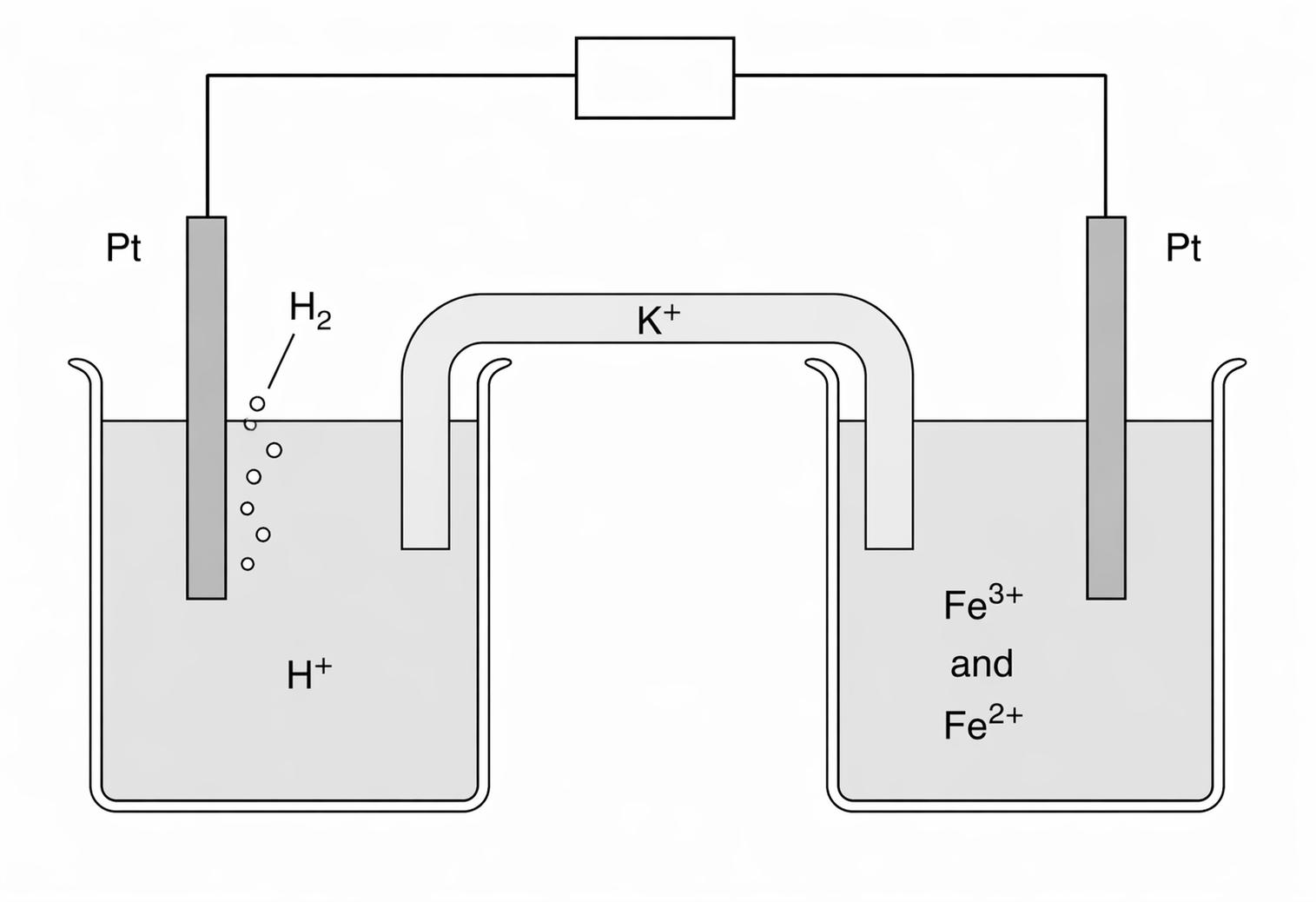
Figure 4 shows an electrochemical cell diagram on an exam question. An extended description of that figure might look something like this:
Extended Description for Electrochemical Cell (Exam Question)
- Beaker containing:
- Rectangle labeled
- Shaded area with
- Solid line connecting rectangles with box in center
- Beaker containing:
- Rectangle, labeled
- Shaded area with and
- Tube connecting beakers containing:
Use Caution with Line cell Notation
While standard line notation is more compact and accessible, interpreting it is often a separate skill from interpreting a visual diagram. To ensure all students are tested on the same concepts, provide an extended description of the visual diagram rather than replacing it with line notation. However, providing both side-by-side is a valuable way to help all students bridge the two representations. This is also another area where context really matters. For instance, the meaning of the same cell diagram in a trade journal meant to be read by professional chemists likely could be sufficiently conveyed to blind and low vision chemists using line cell notation.
Working with Extended Descriptions
Creating accessible content is often a balancing act. While detailed descriptions are essential for screen reader users to grasp complex diagrams, presenting that much text all at once can be overwhelming for others. The goal is to provide technical clarity and detail without creating "information overload." The following section suggests how extended descriptions can be implemented in HTML and PowerPoint in ways that balance accessibility needs with a clean, user-friendly design.
Extended Description in HTML and PowerPoint
HTML documents
Extended descriptions can be made collapsible using <detail> and <summary> tags. This allows them to be collapsible so that students have a choice whether or not to view them. This is important in terms of accessibility intersectionality: while students who use screen readers because they are blind or low vision need extended descriptions, it may unacceptably increase the cognitive load for students with certain cognitive disabilities to have additional blocks of text exposed by default.
Microsoft PowerPoint
In Microsoft PowerPoint, our standard suggestion in the past has been to place extended descriptions in the Speaker Notes section. However, given the potential complexity of STEM extended descriptions, we would recommend that extended descriptions in courses like Chemistry use the newer Appendix method instead. In this method, extended descriptions are placed on the main content area of a separate slide and then linked to.
First, you’ll need to create the description slide. It can be at the end of the presentation so that it won’t interfere while presenting or filming the lecture.
- Select a template from the New Slide menu, enter a title like “Extended Description for [name of diagram]”
- Write the description needed to understand the diagram in the content area of the slide.
- After the description, you’ll need to create a link that jumps back to the original slide. Add link text to the end of the slide like, “Return to Slide [Number of slide the original diagram is on].”
- Then highlight the text, select Insert from the ribbon, and then choose Link to bring up the Insert Hyperlink menu.
- Choose Place in This Document from the Link to: menu on the left side of the menu. This will bring up a list of slides in the presentation. Locate and select the slide that contains the original diagram and click OK. You can use Ctrl + Click to test the link.
Now, you’ll need to return to the original slide to create a link to that description. You’ll need to create a textbox underneath the diagram to house the link. To create a textbox:
- Select Insert from the ribbon.
- Choose Text Box from the Text section.
- Under the image, click and drag to create the box. A cursor should appear.
- Type your link text, e.g., “Extended Description of (name of diagram)”
- Turn the text into a link using the Place in This Document option we used on the description slide.
Be sure to test both links to make sure they lead to the correct slides. Once complete, the extended description will be easily available for all learners.
Interactive Tools and Formats
Ideally, diagrams for chemistry would be fully interactive so that AT users could navigate and interpret them in the same way as other students. Unfortunately, the underlying technological framework is not there yet. For example, although inline scalable vector graphics (svgs) can be created so they are tab navigable and allow screen readers to read the text inside them, none of the major environments (Canvas, Microsoft Office, etc.) allow for inline svgs, only embedded ones. In addition, creating interactive svgs requires svg coding knowledge, which many instructors may not have.
Graphs as Interactive Data
Because a lot of common "diagrams" in General Chemistry are really just graphs that chemists have created specialized conventions for, instructors should consider whether their diagrams could be made interactive by using tools like the Desmos Graphing Calculator. For instance, for titration curves or kinetics plots, instructors might consider using the Desmos Accessible Graphing Calculator. This allows students to explore the data points directly via audio trace. For more on presenting diagrams as graphs, please our Desmos Accessible Graphing Calculator Guide where many of the graphing examples are from Chemistry.
Scalable Vector Graphics with Interactive and Non-Interactive Images
Scalable vector graphics (SVGs) are a promising area in STEM accessibility. They are inherently responsive to resizing and, with proper inline coding, any text inside them can be directly read by screen readers. Coding interactive SVGs requires specialized knowledge, however, and is beyond the scope of what we are recommending at this time. That said, we do highly recommend the .svg file format for non-interactive images, as they will visually scale more cleanly than other formats.
Microsoft Office Diagrams
In Microsoft PowerPoint, complex diagrams can be made accessible through the strategic use of content placeholders, images with alt text, and a strictly verified reading order. However, because manual adjustments to slide layouts can easily break the logical flow for assistive technologies, these diagrams are highly prone to errors. Any diagram built this way must be verified using the Reading Order pane and the Accessibility Checker to ensure the sequence of information is conveyed as intended. Instead, we recommend providing accurate alt text and extended descriptions where needed for static diagrams. Microsoft SmartArt is not recommended for instructional content, as it is not reliably screen-reader accessible.